Client
Year
2022
Categories
- Branding
- Graphic design
- Social networks
- Web
- Multimedia
- Mershandisign
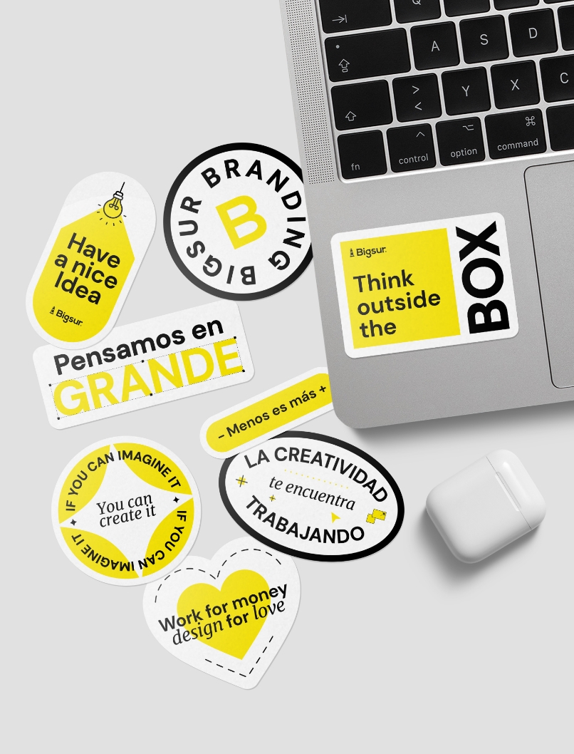
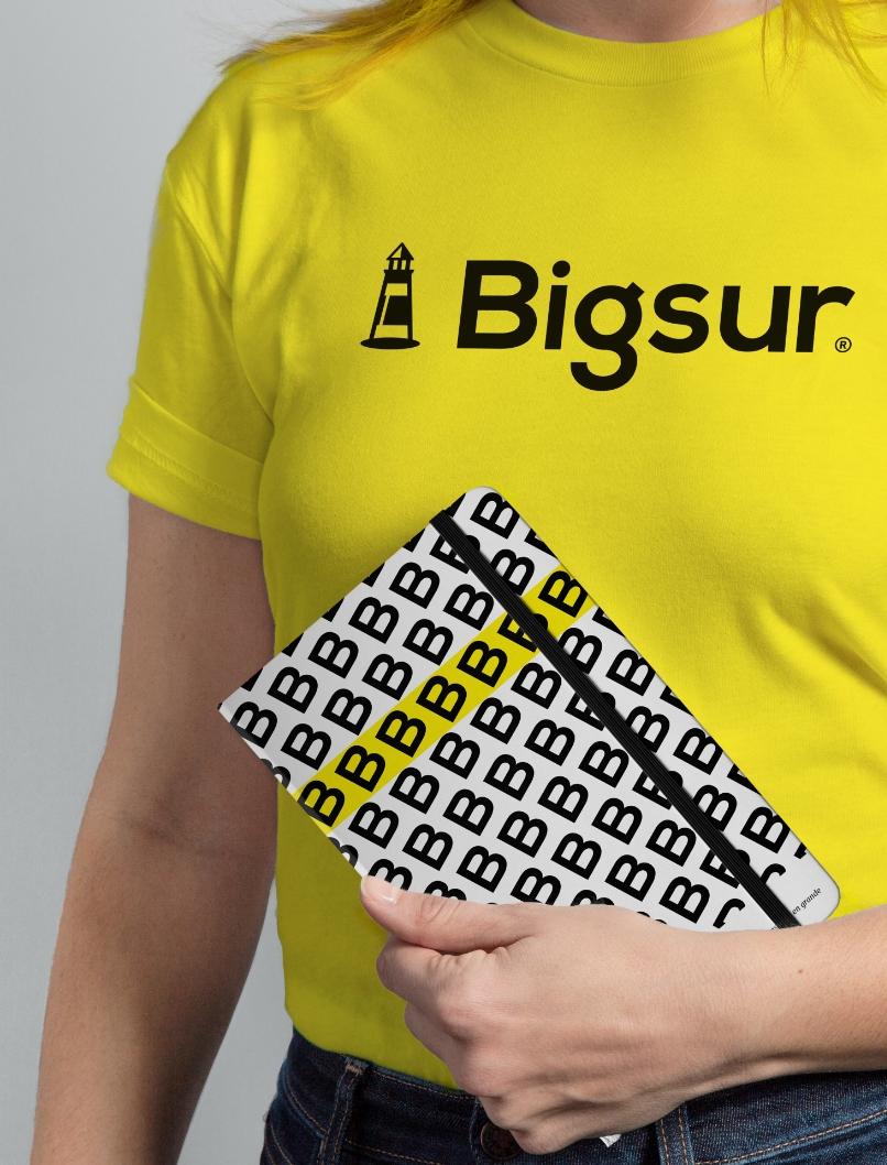
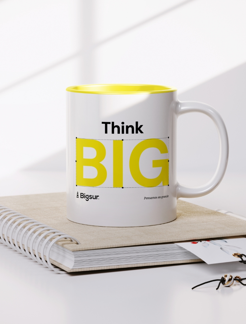
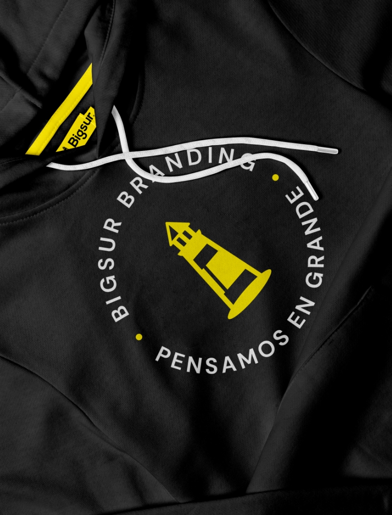
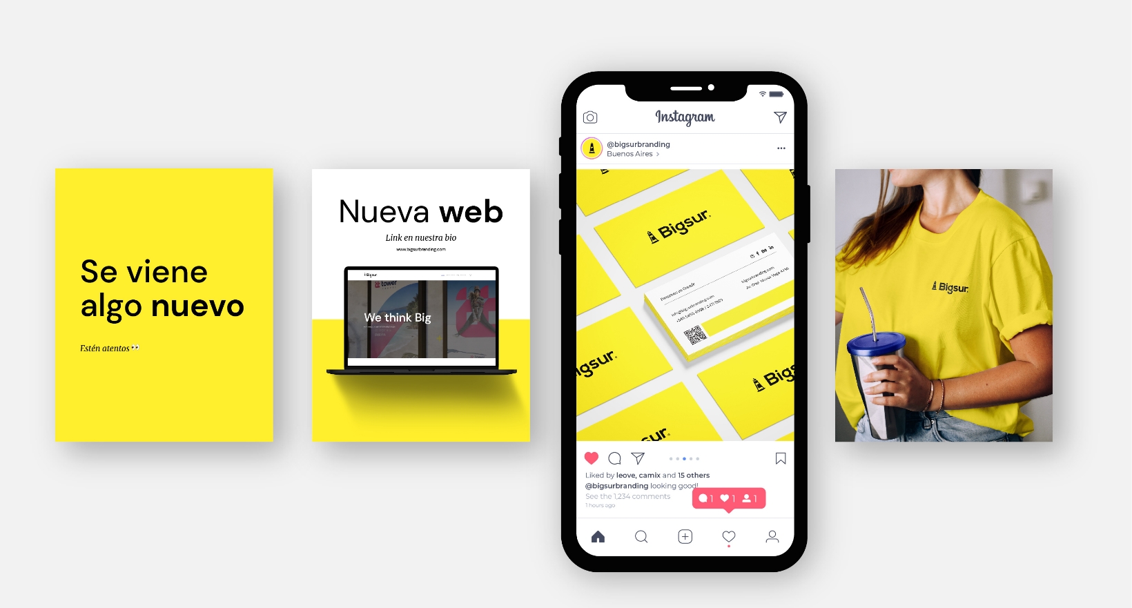
It’s time to present the Bigsur rebranding project, our agency. We spent a whole year working on our new image. We hope you like it!
Case study
In the middle of the Coronavirus pandemic and with our agency growing exponentially, we decided it was time for a makeover. Therefore, we needed a current image that expresses what we are today: an agency that builds better brands for a better world. However, our dedication to our clients and our commitment to service quality delayed our plans.
Results
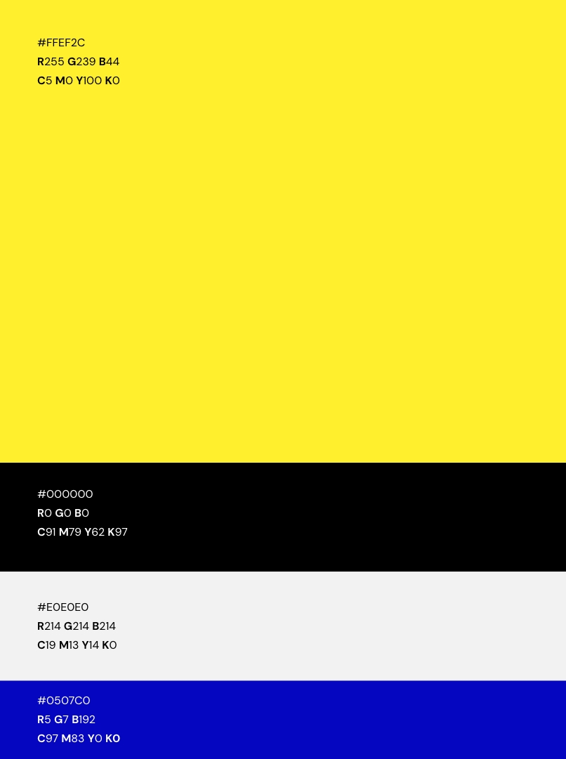
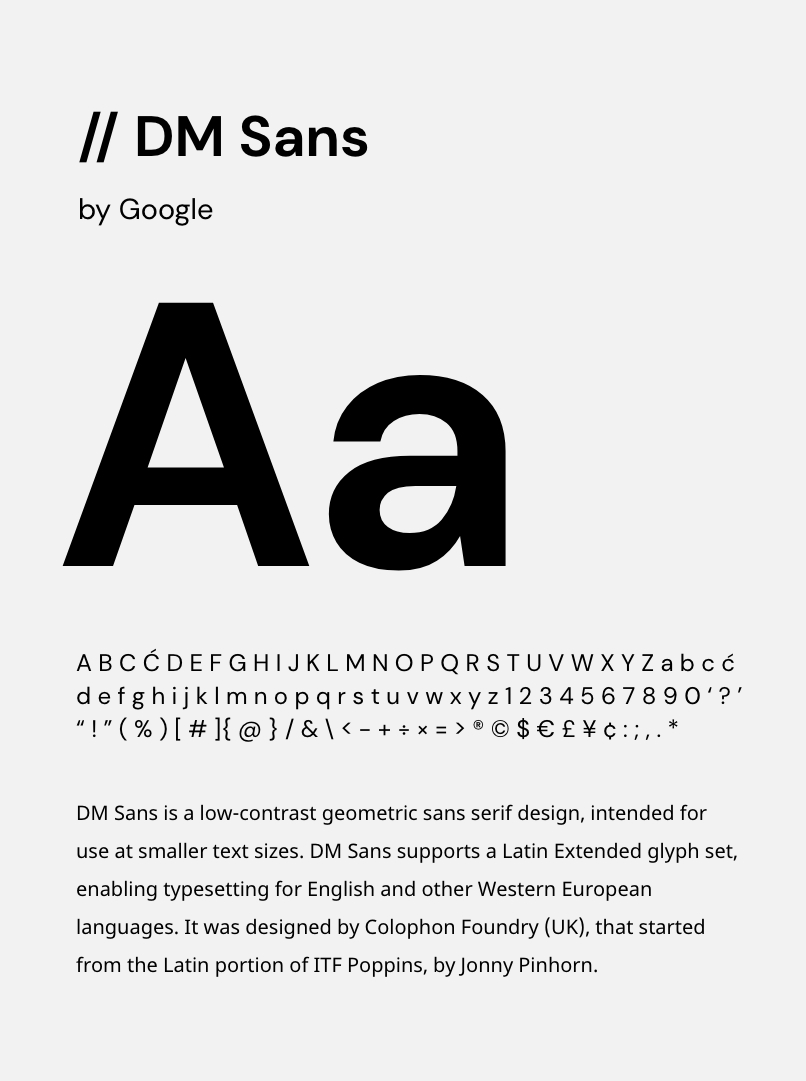
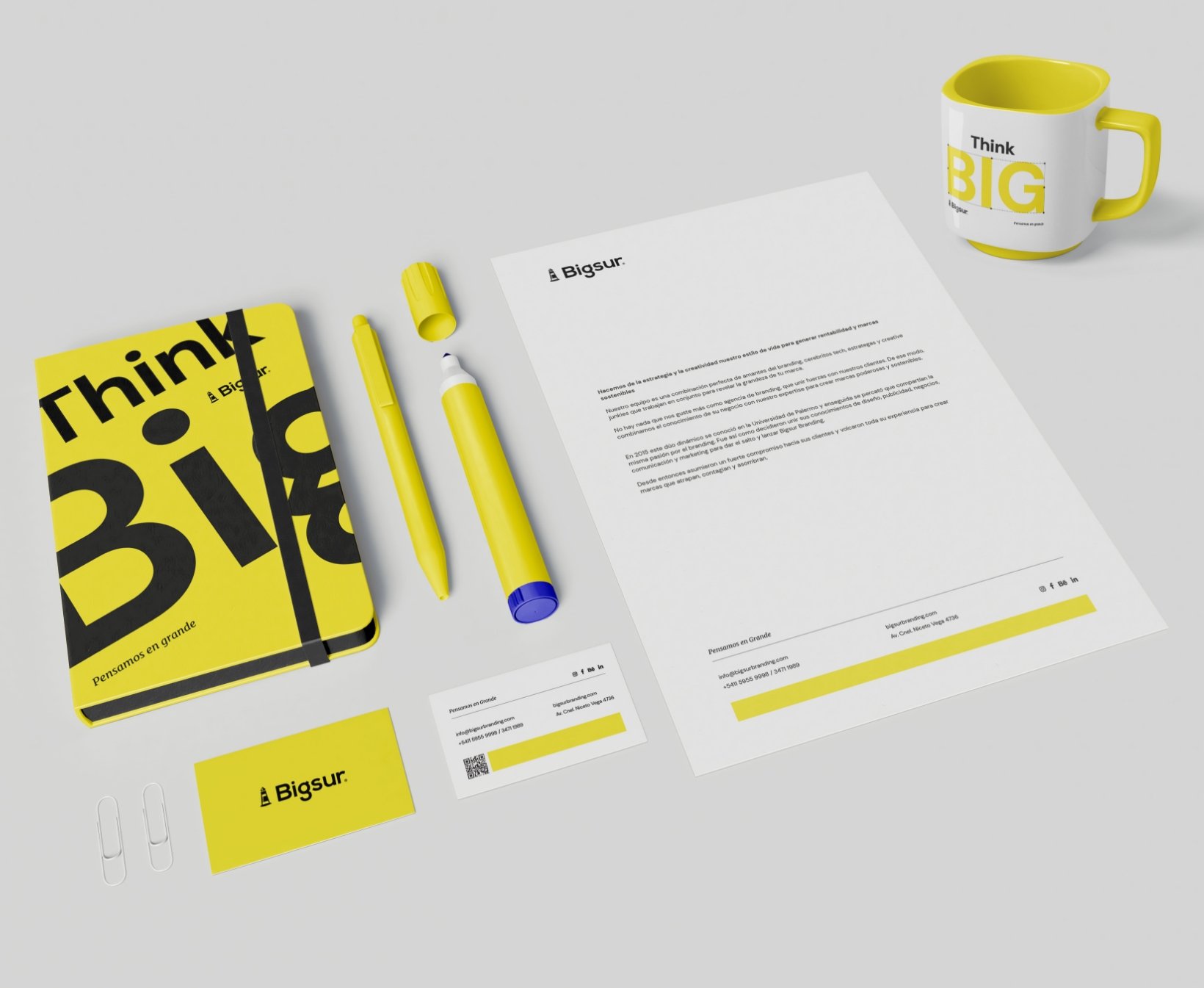
Firstly, we work on our new identity based on our values and purpose. Secondly, we seek to simplify without being simplistic, to modernize without being ordinary. The result was a solid, sustainable, close, vibrant, youthful, and energetic identity. An identity that sums up who we are: a group of creatives with a big heart and a great future.
Experience
Finally, the Bigsur rebranding project represented a beautiful journey toward the essence of a young agency with great convictions. It was also knowing our limitations and overcoming the challenges that arose along the way. On the other hand, work patience and be sure that everything comes in due time. Finally, we trusted in a team that leaves everything every day and always seeks to do great things.

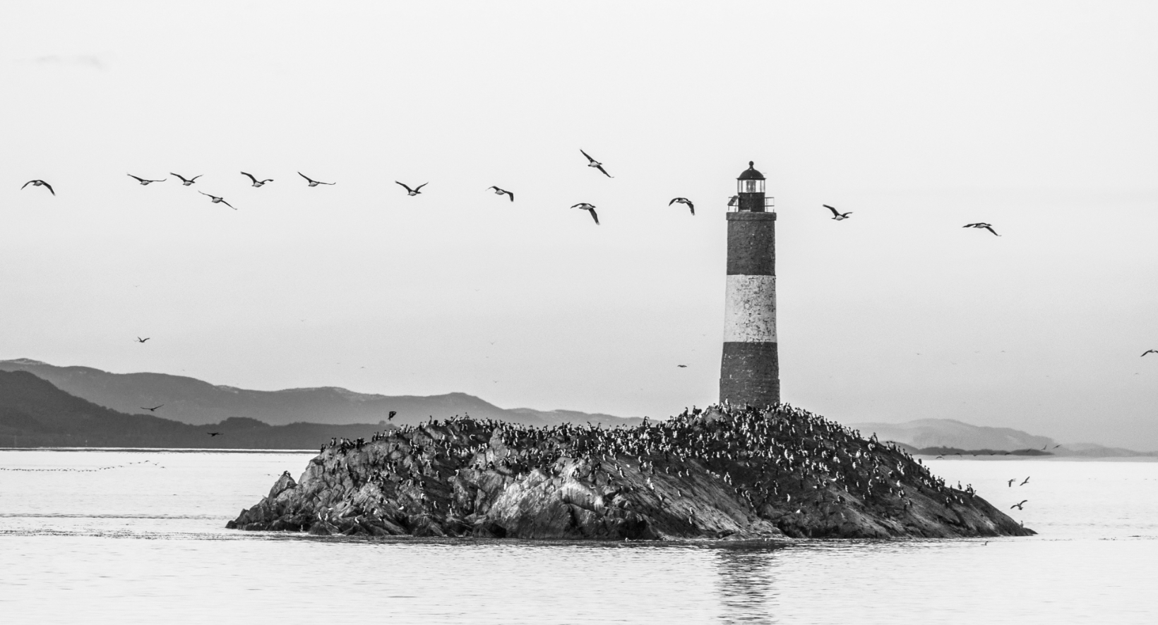
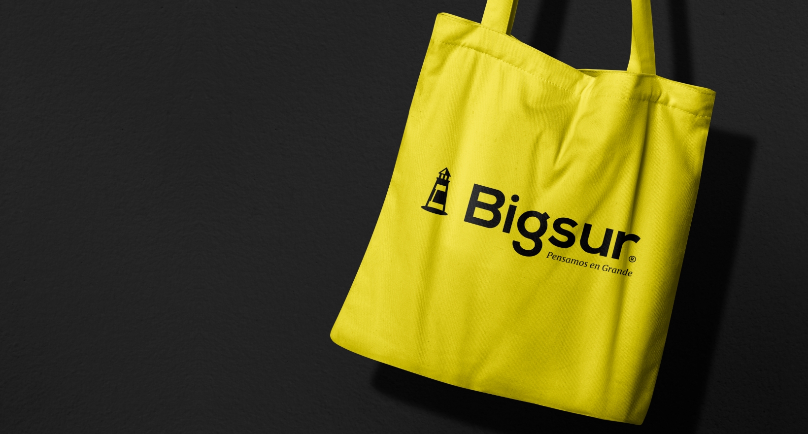
The Bigsur symbol tells a lot about our essence and our history.
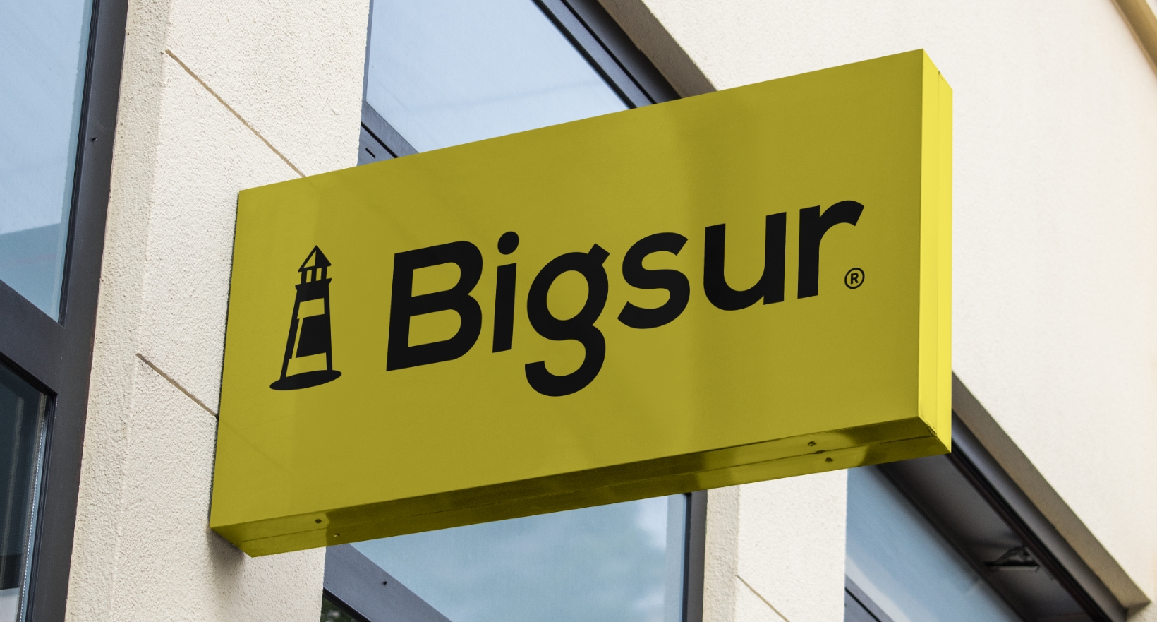
From the beginning, we think of Bigsur as an agency that accompanies and enlightens its clients to find the brands that represent them. From there arose the idea of the lighthouse as a representative element of our purpose. In addition, it joins the image of the famous lighthouse at the end of the world, something characteristic of the south, where we come from. All this led to laying the foundations of a consistent, close, referential, and original identity we are proud of. Here is our symbol.
